Business
Top 10 Ted Talk Presentations Using Engaging Visuals

Are you wondering how to make use of visual graphics for your presentations? Here are the top ten Ted Talk presentations to inspire you:
#1 The Beauty of Data Visualization


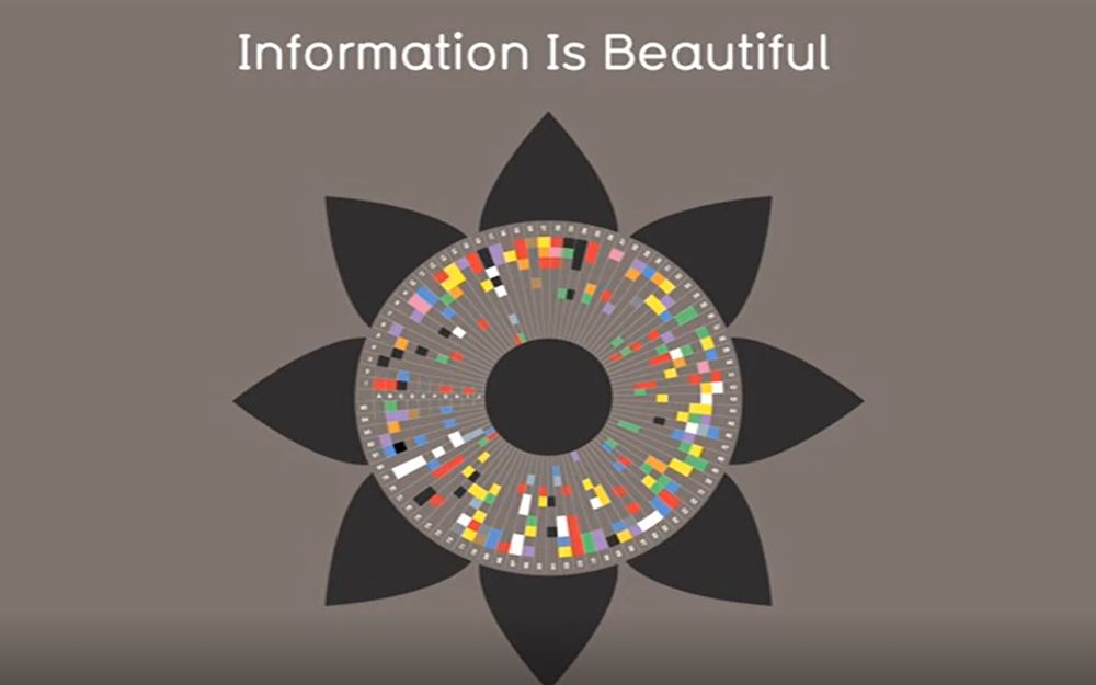
If your job description includes presenting data, facts, or statistics, you need to check out David McCandless’s Ted Talk presentation. It’s best to strategize how your data appears in your presentation without giving audiences an informational overload. According to David, information is supposed to be beautiful. If you want to convey that sentiment to your audience, you need to choose how you visualize your data.

So, to visualize a vast amount of data into one stunning visual for your presentation, you need to keep in mind the following:
- Clean
- Sharp details
- Easy to read
Besides the requirements mentioned above, you need to keep your colors, fonts, and design cohesive. Make sure that each slide is easy to digest at a glance. It’s crucial to portray data into simple figures instead of overcomplicating it.
#2 A Darwinian Theory of Beauty
Throughout philosophy, professor Denis Dutton’s talk presented beautiful visuals sets of live drawings that follow his words. It’s essential to note that Dutton took his viewers on a visual journey as the illustration feels alive.
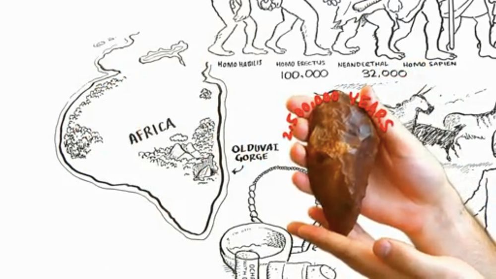
It’s an interesting approach, although it can be pretty labor-intensive as it showcases intricate details. However, this approach helps immerse your audience with your presentation.
#3 Bitcoin. Sweat. Tide. Meet the Future of Branded Currency
Consistency is always king when we talk about presentations. If you want to keep track of what you’re saying, keep your presentation consistent in terms of:
- Style
- Layout
- Color Palette
- Typography
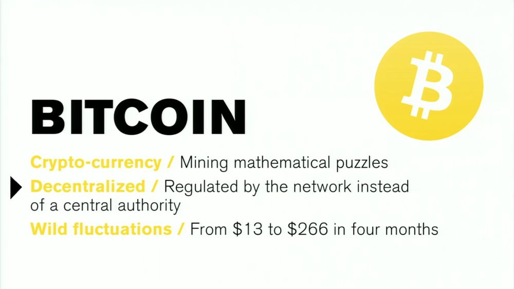
It’s essential to note how Paul Kemp-Roberston takes advantage of the color scheme to deliver compelling slides.


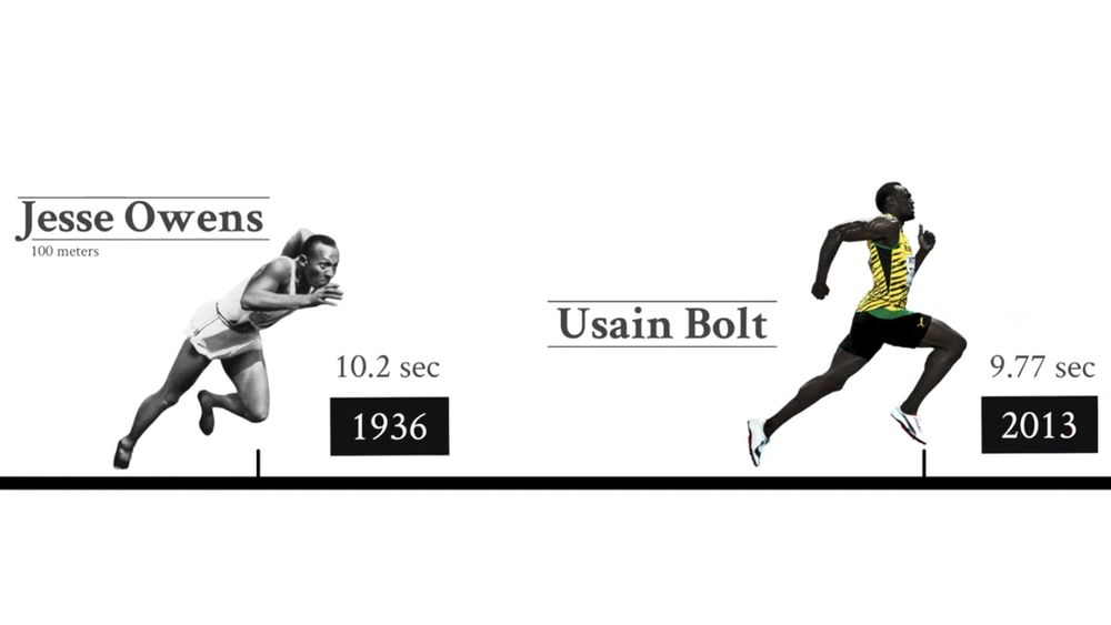
#4 Are Athletes Really Getting Faster, Better, Stronger?
David Epstein’s Ted Talk presentation delivers facts and numbers with the help of striking visualizations. Here are the visual elements you need to take note of:
- Consistent design theme
- Powerful athletic imagery
- Striking use of color
- The occasional pop of colors in a black and white slide

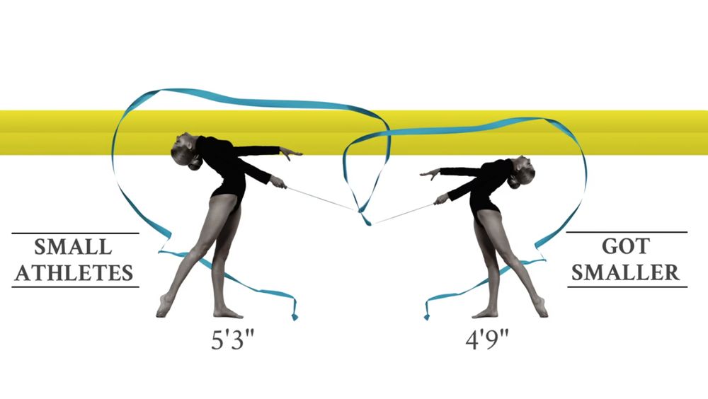
Again, this presentation’s use of color is crucial as it guides the audience’s eyes to relay information.
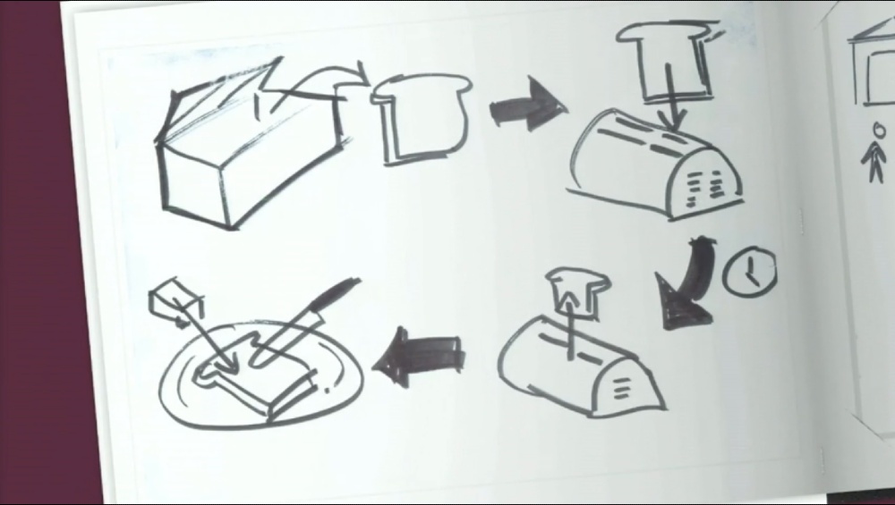
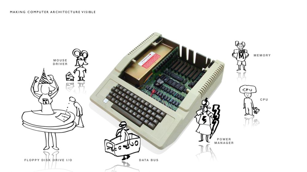
#5 Got a Wicked Problem? First, Tell Me How You Make Toast
Sometimes the visuals you display don’t need to fit with your presentation style. In short, presenting a mismatching style is also a way to draw the audience’s attention.
*insert Tom wujec’s drawing.jpeg
However, you need to incorporate at least one or two consistent elements through your slides. Although a unique illustration is a great idea, we still want our audiences to comprehend your slides. Here are some details to choose from:
- Color
- Front
- Graphic
- Layout
*insert wujec’s system model.jpeg
Remember to take note of how Tom Wujec executed a perfect balance in his presentation.

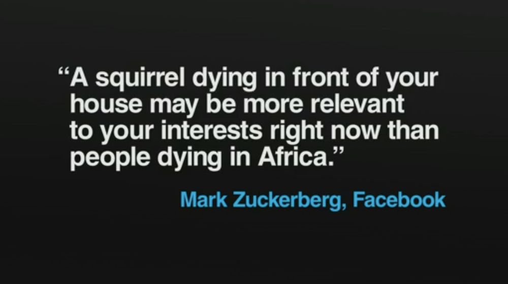
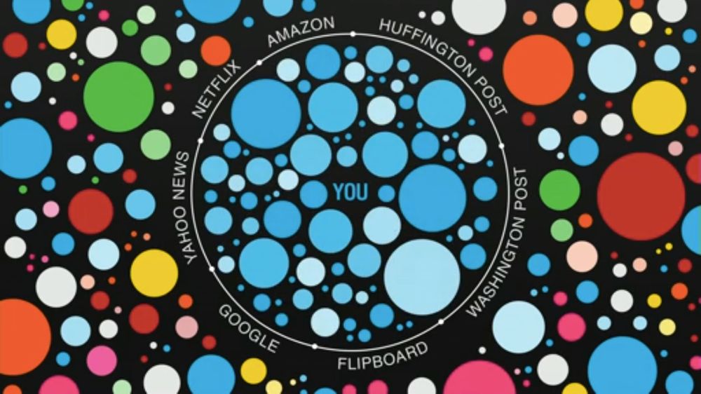
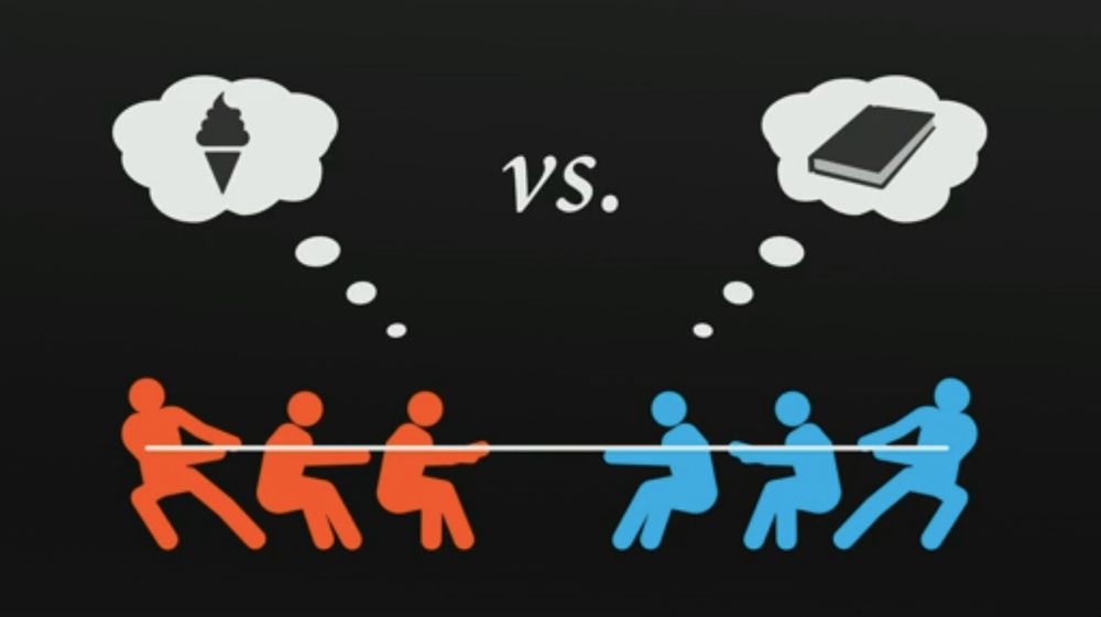
#6 Beware Online “Filter Bubble”
It’s essential to portray a visual presentation of what you’re saying instead of your speech’s mirror image. Take note of how Eli Pariser showcases various ways how to present his data.
- Sometimes, all you need is good typography to emphasize your quotes.

- It’s also vital to portray the concept of your presentation through a minimalist diagram. See how Eli presented “filter bubble” with a playful yet minimalist chart.
- It’s also OK not to include information on your slide. Let the image speak for itself as you conduct your presentation and commentary.

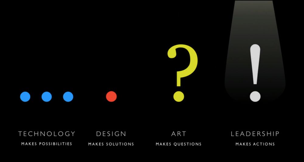
#7 How Art, Technology and Design Inform Creative Leaders
In creating an immersive and engaging presentation, you need to create a graphic that can interact with your speech. Maeda’s presentation incorporates moving visuals with his speech, creating a more immersive experience for audiences.
All you have to do is combine the following:
- Sleek graphics
- Illustrations
- Video footage

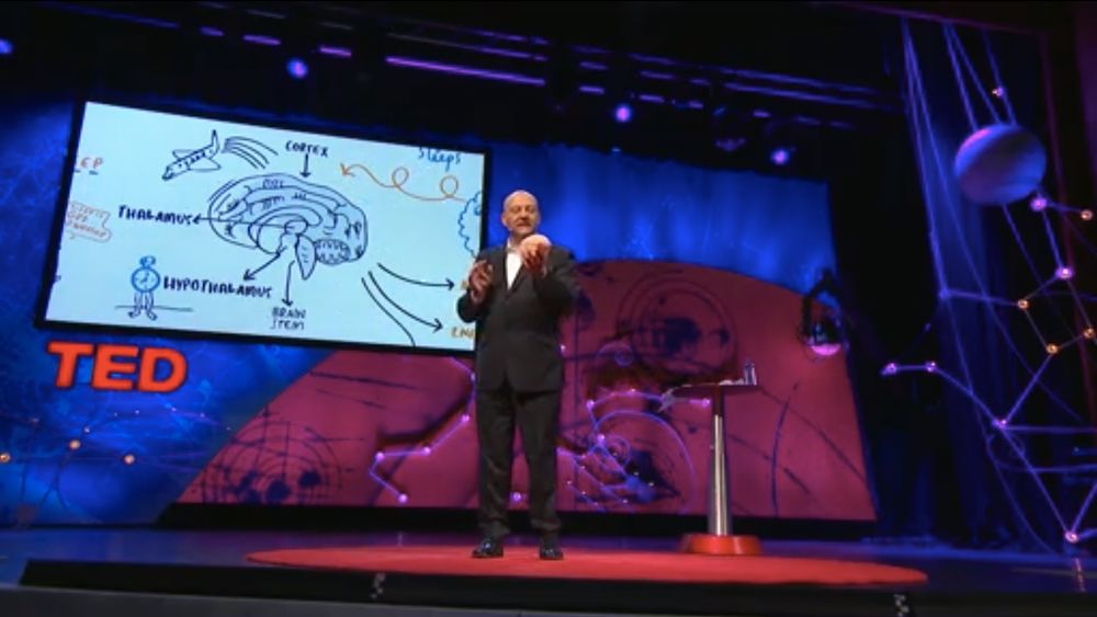
#8 Why Do We Sleep?
Russell Foster presents another example of a highly detailed illustration. The presentation scrolls from one image to the next as following Foster’s speech. Each slide does not only complement his words but also acts as a data visualization for specific information.
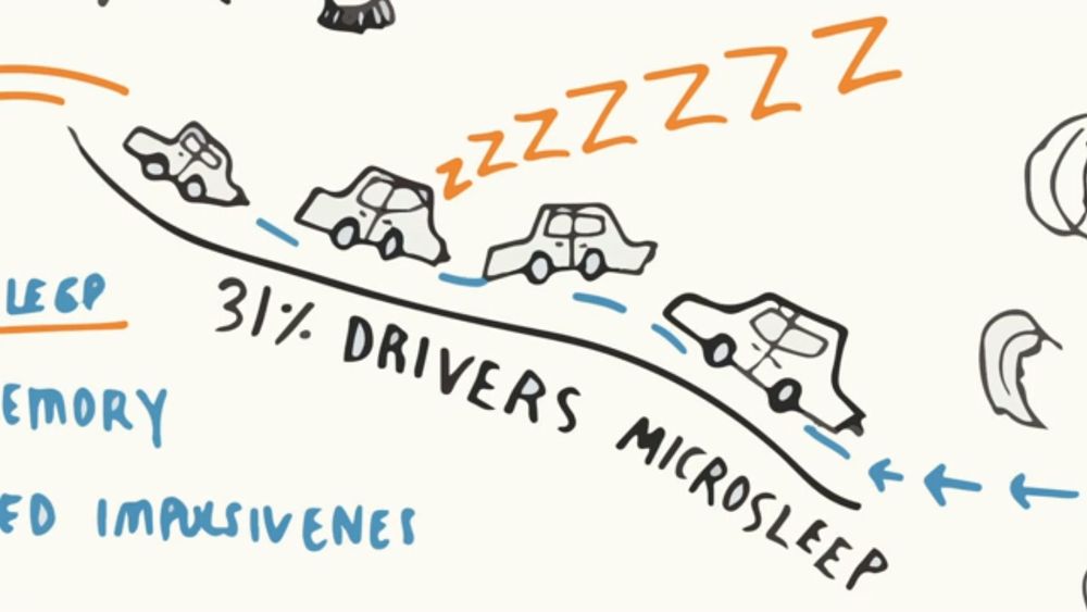
Besides his heavy illustrated Ted Talk presentation, he brings in a prop to further help his audience immerse with the presentation.
#9 Psychedelic Science

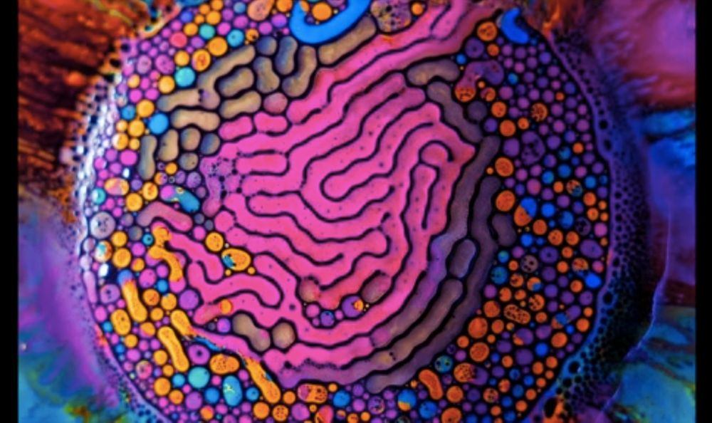
Fabian Oefner begins his talk by saying that an image is worth a “thousand words.” After conveying that, he proceeded by showing a few images to his audience. It’s important to note that Oefner did not use typography in his presentation as he lets his psychedelic images speak for themselves.

#10 Embrace the Remix
Adding typography can either help or break your presentation. Some people choose not to use too much text in their presentation. However, if you want to insert a text or description into your presentation, look at Kirby Ferguson’s talk.
Based on the image above, Ferguson likes to combine type plus imagery in his presentation. It’s essential to take note of the consistent color and font type on each of his slides. He also uses a clever technique of “scale and masking” certain elements to draw focus.