Technology
What is A Data Visualization Tool? Here Are Your Top 10 Choices

Artificial intelligence, machine learning, and robotics are among the sought-after careers in recent years. Data science is a booming career path, too. However, analyzing large volumes of data isn’t always simple. Sometimes, data sets are so large and complicated that it is almost impossible to understand their purpose. That’s why every data scientist needs a powerful data visualization tool.
Data Visualization Overview
In any data-driven enterprise, data visualization is essential. It translates data into visuals, making it easier to recognize and understand. Data visualization also helps teams make crucial business decisions and create realistic insights about the business. Data visualizations apply to annual reports, sales reports, dashboards, marketing materials, and any information that requires immediate interpretation.
Many data visualization tools help data scientists perform their job efficiently. A good data visualization tool should be easy-to-use and versatile, allowing them to visualize data differently depending on business needs. In addition, a data visualization tool provides designers with a more straightforward process for creating visual representations of large data sets. Below are the top ten data visualization tools for data scientists.
1. Tableau


Tableau is a visual analytics tool that aims to transform how we use data to solve problems. The platform has different options, such as a desktop app, server and hosted online versions and a free public version. Similarly, it has hundreds of data import choices, including CSV files, Google Ads and Analytics data, and Salesforce data.
The Tableau public version is free to use for individuals seeking a powerful way to create data visualizations.
2. Infogram

Infogram is a drag-and-drop visualization tool that allows designers and non-designers to create compelling data visualizations for infographics, dashboards, maps, marketing reports, social media posts, and more. This visualization tool also offers a WordPress plugin that makes embedding visualizations easier for WordPress users.
3. ChartBlocks
ChartBlocks says it can import data from “anywhere” using its API, including live feeds. While some say importing data from any source can be done in a few clicks, it’s expected to become more complicated than other apps.
ChartBlocks allows for extensive customization of the final visualization created, and the chart building wizard helps users pick precisely the correct data for their charts before importing the data.
4. Google Charts
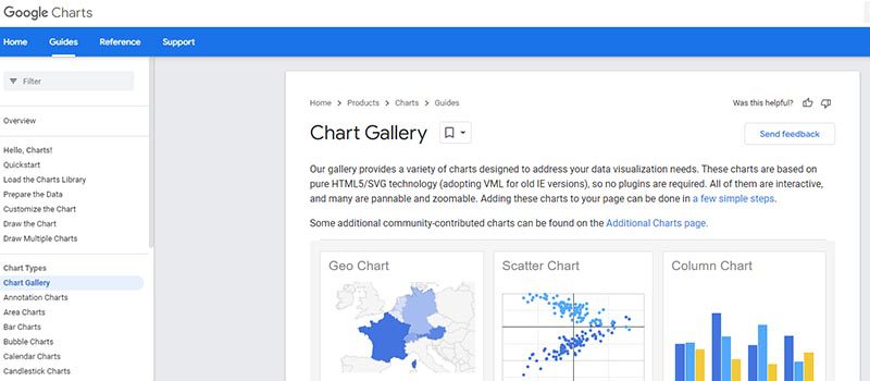
Google Charts is a powerful and free data visualization tool for making interactive charts. The app works with dynamic data, and the outputs are more on HTML5 and SVG, so they work in browsers without using additional plugins. It can accommodate data sources, including Google Spreadsheets, Google Fusion Tables, Salesforce, and other SQL databases.
5. Datawrapper
Datawrapper was explicitly created for integrating maps and charts into news articles. The charts and maps created are interactive, making them perfect for embedding on news portals. However, their data sources are limited, with the primary method of copying and pasting data into the tool.
Datawrapper visualization types include column, line, and bar charts, election donuts, area charts, scatter plots, choropleth and symbol maps, and locator maps. Several publications, including Mother Jones, Fortune, and The Times, use their charts.
6. D3.js
D3.js is a JavaScript library for analyzing documents through data. It requires at least an overview of javascript (JS). Some of its advantages are:
- Powerful and customizable
- Large number of chart types possible
- Focuses on web standards
- Tools available to allow even non-programmers to create visualizations
- Free and open source
7. FusionCharts

FusionCharts is also a JavaScript-based tool for designing web and mobile dashboards. It consists of more than 150 charts and 1,000 types of maps. It can work with popular JS frameworks (including React, jQuery, React, Ember, and Angular) and server-side programming languages (including PHP, Java, Django, and Ruby on Rails).
FusionCharts gives ready-to-use code for all chart and map variations, making it easier to embed in websites even for those designers with limited programming knowledge. FusionCharts is also one of our list’s most powerful data visualization tools.
8. Chart.js
Chart.js is a simple but flexible JavaScript charting library. It’s open source, provides a variety of chart types (eight total), and allows for animation and interaction.
Chart.js uses HTML5 Canvas for output, rendering charts well across all modern browsers. Graphs are also responsive, so it’s excellent for creating mobile-friendly visualizations.
9. Grafana
Grafana is open-source visualization software that lets users create dynamic dashboards and other visualizations. It supports mixed data sources, annotations, customizable alert functions, and plugins. That makes Grafana one of the most robust visualization tools available.
Export functions allow designers to share snapshots of dashboards as well as invite other users to collaborate. Grafana supports over 50 data sources via plugins.
10. Polymaps

Polymaps is a dedicated JavaScript library for mapping. The outputs are dynamic, responsive maps in various styles. Polymaps uses SVG to create the images, so designers can use CSS to customize the visuals of their maps.
Honorable Mentions
Conclusion
With the large selection of visualization tools, designers may find it hard to decide which one to use. However, designers should note essential features like being user-friendly and applicability to their specific requirements. Most data visualization tools include free trials, so it’s worth trying a few before deciding on a single platform.