Philly
New Eagles Logo Polarizes Philadelphia Sports Fans

Philadelphians don’t love change.
It’s a city of traditions, steeped in sentimentality and famous for its gritty charm. It becomes evident quickly around here: Philadelphia has completely internalized the Rocky complex. An intense underdog spirit with an unparalleled sense of pride over the city’s rich bounty of cultural offerings, from its American history to its renowned cuisine. This pride also extends to its rabid sports fandom.
And so, in keeping with the city’s undying affection for its own established iconography, its collective reception of the Eagles’ recent decision to alter their wordmark is… lukewarm at best.
Sports logo alterations are always a polarizing subject. They’re made for a number of reasons, be it injecting fresh enthusiasm (and money) into a dulling franchise or steering away from dated, racially charged mascots.
In that sense, team rebrands seem like a perfectly American affair. As it so often is, the two biggest consistencies are financial pursuits and awkwardly fumbling over unhealed racial trauma.
But the Eagle’s recent decision doesn’t really serve either purpose. And it’s more of a retool than a redesign.
For one, there are no real changes being made to the team’s color scheme. Its usual palette of midnight green, silver, black, and charcoal will remain fully intact. And the team’s logo— the famously left-facing bald eagle— will also be untouched.
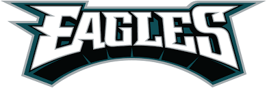
This retool comes for one victim and one victim only: the wordmark.
In the team’s recent press release, where it outlines the changes, the new design was touted for its “new” and “refreshed” look. But that doesn’t really speak to the changes being made. So, let’s dig into the new wordmark, how it compares to the old one, and how fans have responded.
A step towards modernity.


The new wordmark is in line with the most prevalent design trend right now: the reduction of flamboyant embellishment into modern, chic simplicity.
It’s the new normal— but it’s not entirely new. For decades now, companies have been rebranding with these modern ideals in mind. They’ve done away with ornate logos, rich with color and elaborate graphics, in favor of a more straightforward approach. As far as typography is concerned, we see this race towards less manifest as reliance on grotesque or sans serif typefaces.
You’ve undoubtedly taken notice of this trend, whether you know the terminology or not. Since the mid-20th century, these typefaces have been heralded for their legibility and modern feel. And a number of companies have shaped their brand around the voguish style of their letterforms.
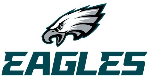
As you can see, the Eagles have finally caved to the trend.
The previous iteration of the typeface, adopted in 1996, saw the team deploy a sharp, three-dimensional serif typeface with a strong drop shadow. It’s loud, blocky, and extravagant, especially when contrasted with the new design.
2022’s newly updated wordmark unveils the team’s leap into stripped-down sans serif territory. The font is still quite stylized and is surely a custom creation designed purely for the Birds’ new look. But it’s toned down. And the letterforms are low-contrast now, meaning there’s very little difference in stroke thickness in any of the letters.
It’s also been reduced to two dimensions, which is another trend you’ll find in contemporary rebranding. The shiny car emblem look is out; flat and monotone is in.
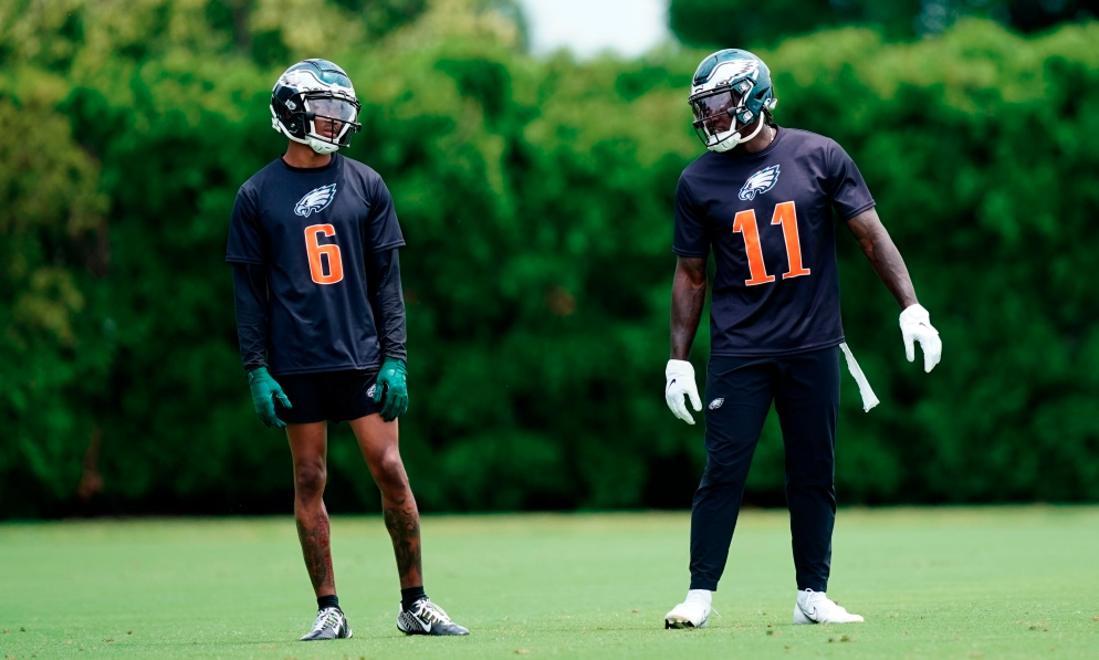
Where will we see the new eagles logo?